Light blue is the color that makes a living room feel like a deep breath. It is calming, airy, and surprisingly versatile when you know how to style it right.
If you want to compare this against something a touch warmer, a warmer neutral to weigh against it is worth a look too.
Let’s get started.
Powder Blue Walls with Cream Linen Sofa
Powder blue is soft enough to keep a living room feeling calm rather than cold. A cream linen sofa against it adds warmth so the room does not feel too pale overall. This pairing suits a space wanting a light, airy atmosphere.
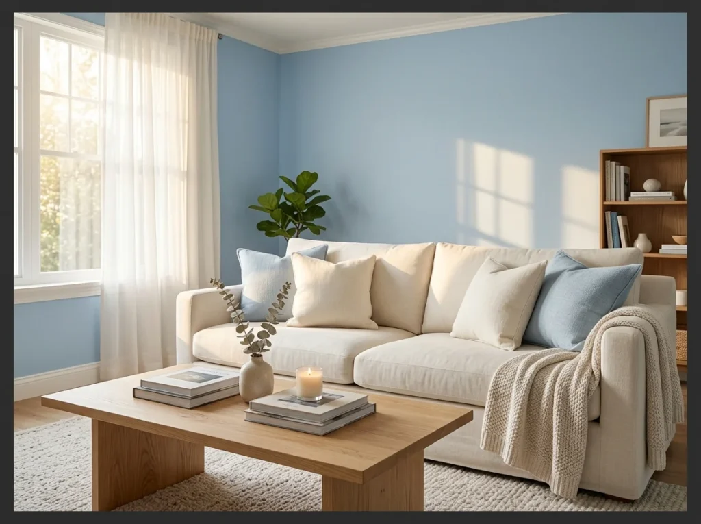
Powder blue walls with a cream linen sofa create the softest and most universally welcoming light blue living room combination available. The warm cream of the linen sofa prevents the pale blue from reading as cold or clinical and the two tones balance each other naturally.
This combination suits almost every home style from coastal to transitional to farmhouse. The key is keeping the sofa in a true warm cream rather than a stark white, which would make the blue feel chillier than intended. Warm cream is the bridge that makes powder blue feel genuinely cosy.
Light Blue Accent Wall Behind the Sofa
Painting just the wall behind the sofa keeps the color contained to one focal point. This approach adds interest without committing the whole room to a single shade. It suits a living room wanting color without a full repaint.
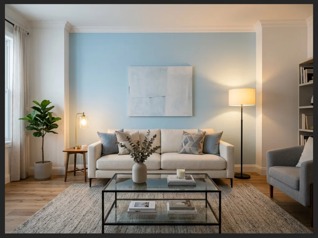
Painting only the wall behind the sofa in light blue creates a focused focal point without committing every wall in the room to color. The single blue wall frames the seating area visually and makes the sofa feel anchored and intentionally placed.
Keep the other three walls in soft white or the lightest possible off-white to maintain the airy quality that light blue living rooms are known for. This approach is ideal for anyone who loves the color but wants the flexibility to change it without a full repaint in the futu
Coastal Light Blue with White and Rattan
Light blue and white together instantly reads as a classic coastal combination. Rattan furniture or accents add texture that keeps the palette from feeling flat. This pairing suits homes near water or those wanting that relaxed beach feel.
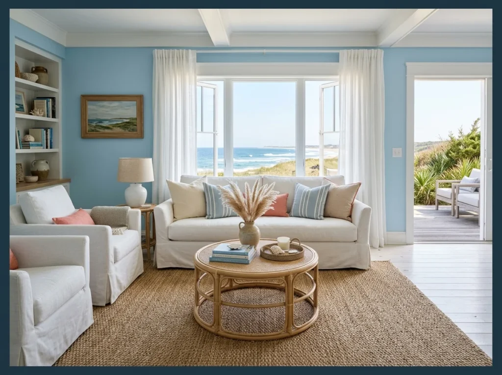
Light blue walls with white furniture and natural rattan create the most authentic and effortlessly achieved coastal living room look. The combination of cool blue and warm natural fiber creates balance that feels like it belongs near the water.
Rattan specifically bridges the gap between the cool blue wall and the warm wooden floor in a way that metal or painted furniture cannot. A round rattan coffee table, a woven seagrass rug, and white linen slipcovers are all you need to complete this relaxed, genuine coastal scene.
Once the big pieces are settled, a table dressed to match this mood is what pulls the seating area together.
Light Blue Velvet Sofa as the Star Piece
A velvet sofa in light blue becomes the clear centerpiece of the room. Velvet catches light differently than flat cotton, adding a bit of shine to the color. This piece works best with a fairly neutral backdrop so it stays the main focus.
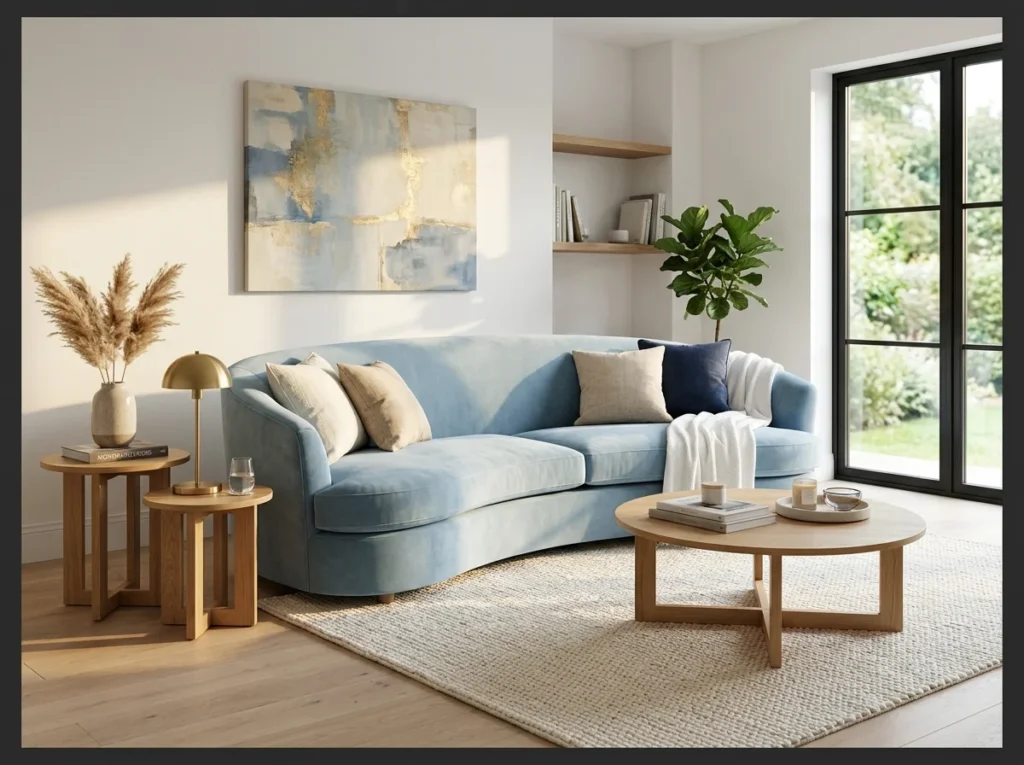
A light blue velvet sofa against white walls makes the sofa the undisputed focal point of the entire living room. The velvet pile catches light differently from every angle and shifts between pale sky and deeper blue throughout the day as the light moves.
Keep everything surrounding it clean and neutral so the sofa reads as the deliberate design choice it is. White walls, a natural wood side table, and a cream woven rug are genuinely all you need. The velvet sofa does all the visual work on its own and any additional color competes with it.
Scandinavian Light Blue with Blonde Wood
Blonde wood furniture keeps a light blue room feeling bright rather than heavy. This combination reflects the pared back, functional approach common in Scandinavian interiors. It suits a living room wanting simplicity alongside a touch of color.
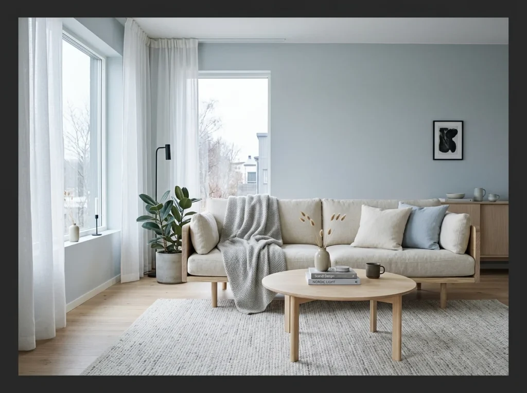
Muted blue gray walls with pale blonde birch or ash wood furniture creates the most true to form Scandinavian light blue living room. The muted quality of both the blue and the wood keeps the palette genuinely quiet and restrained rather than decorative or busy.
Every element in a Scandinavian light blue room should be low profile and purposeful. No unnecessary accessories, no competing colors, no busy patterns. The calm comes from what is absent as much as what is present, and that discipline is what makes this style so genuinely restful to live in.
Light Blue and Warm Wood Combination
Warm wood tones balance out the coolness that light blue can sometimes bring to a room. This pairing works well through furniture, flooring or even simple wood accents. It suits a living room wanting color without losing overall warmth.
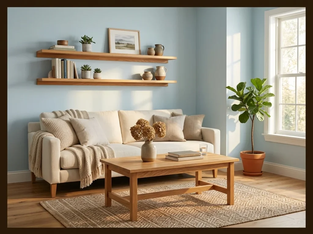
The single most effective way to prevent a light blue living room from feeling cold is to introduce warm oak or walnut wood in three or more furniture pieces simultaneously. The golden undertones of the wood counterbalance the cool quality of the blue and the two materials genuinely complement each other.
Use warm wood in the coffee table, floating shelves, and the floor if possible. The more surfaces the warm wood occupies the more balanced the room becomes. This combination photographs warmly and consistently well, which is part of why it appears so frequently on Pinterest boards dedicated to calm living rooms.
Light Blue Ceiling for Visual Drama
Painting the ceiling instead of the walls is a less obvious way to bring in color. A pale blue overhead can make the ceiling feel higher, almost like an open sky. This detail suits a room wanting a subtle surprise rather than an obvious change.
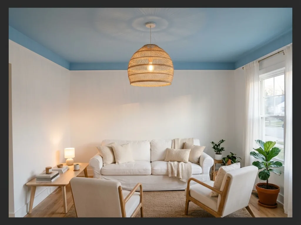
Painting the ceiling light blue while keeping all four walls white creates an unexpected overhead feature that adds color without making the room feel enclosed. The eye travels upward and finds the pale blue above which creates a sky like impression indoors.
This works especially well in rooms with architectural ceiling details like crown molding or a central rose, where the light blue highlights the detail rather than covering it in a plain color. A woven pendant light hanging from the blue ceiling adds a warm material contrast that grounds the effect beautifully.
Light Blue Built-In Shelves
Built in shelves painted light blue turn a functional feature into a design detail. This approach adds color in a contained area rather than across the whole room. It suits a living room wanting to display books or objects against a soft backdrop.
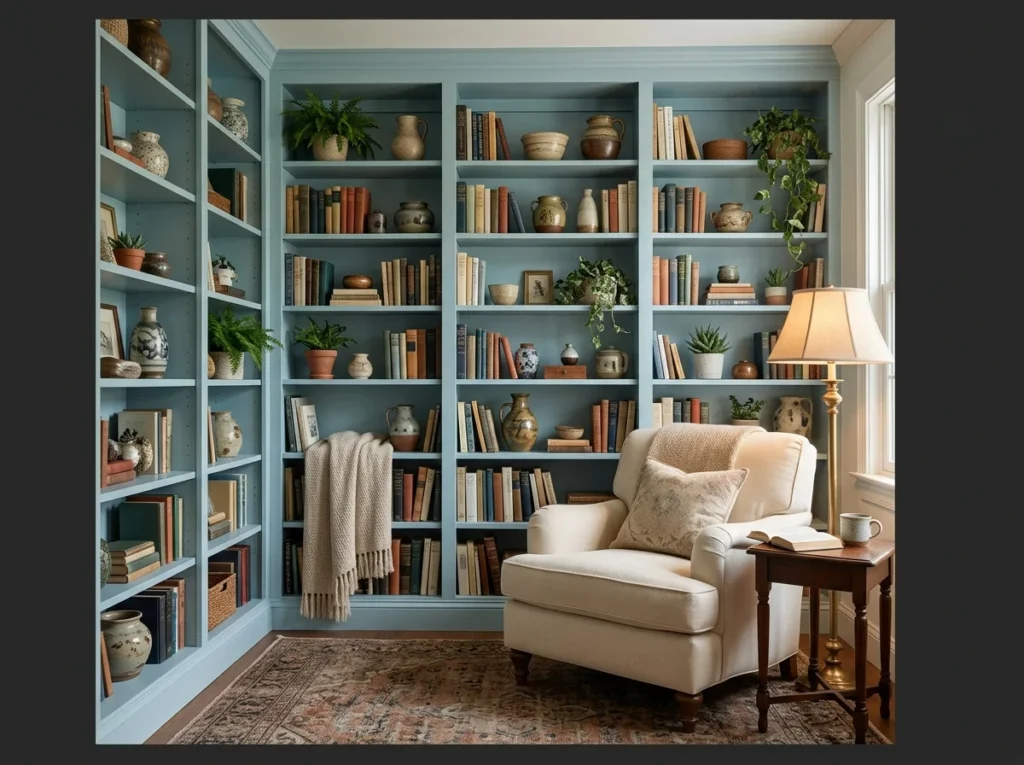
Painting built-in shelves in a soft duck egg or powder blue gives book spines, ceramics, and decorative objects a beautiful backdrop that makes every item on the shelf look more considered and deliberate. White shelves fade into the wall while blue shelves celebrate what sits on them.
Budget friendly option. This is just paint one of the lowest cost transformations available in any living room. The saturated color visible between and behind the shelf objects creates depth that white shelves entirely lack, making the whole wall feel significantly more architectural and purposeful.
If this backdrop trick has you rethinking your shelving, shelves that make the most of color shows how far it can go.
Light Blue and White Striped Accents
Striped cushions or curtains in light blue and white add pattern without much added color. This detail works well layered against solid light blue walls or furniture. It suits a room wanting a classic, slightly nautical touch.
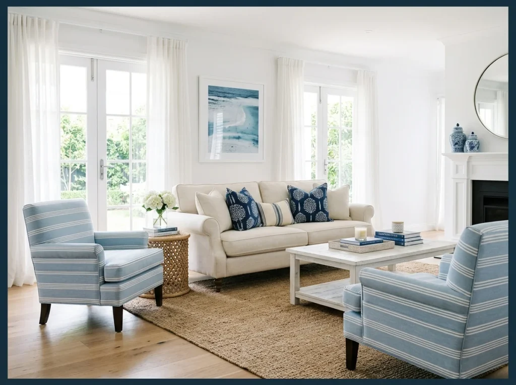
Light blue and white stripes on accent chairs or throw pillows introduce pattern into a light blue living room without disrupting the calm palette. The stripe is graphic enough to add visual energy but the tonal similarity of light blue and white keeps it feeling soft rather than bold.
Horizontal stripes on two matching accent chairs flanking the sofa create a balanced, symmetrical arrangement with coastal character. This pattern suits coastal, Hamptons, and transitional living room styles and works at every budget from canvas outdoor chair fabric to premium upholstered linen.
Light Blue with Mustard Yellow Pops
Mustard yellow provides warm contrast against the coolness of light blue. A few cushions or a single accent chair in mustard is usually enough to make the pairing work. This combination suits a living room wanting color without full commitment to either shade alone.
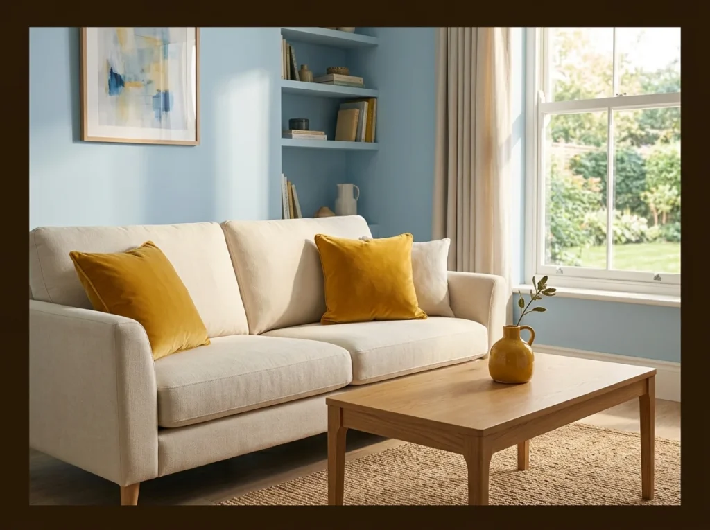
Mustard yellow is the accent color that gives a light blue living room its greatest energy without disturbing its fundamental calm. The two colors sit opposite each other on the color wheel and create a natural contrast that reads as vibrant but never chaotic.
Use mustard in two to three places a pair of throw pillows, a ceramic vase, and a small textile throw. Three points of mustard spread across the room create a visual triangle that carries the accent color through the whole space without concentrating it in one place.
Dusty Blue Walls with Dark Walnut Furniture
Dusty blue leans slightly muted compared to a brighter powder blue. Dark walnut furniture against it creates strong contrast and adds visual weight to the room. This pairing suits a living room wanting a more grounded, sophisticated feel.
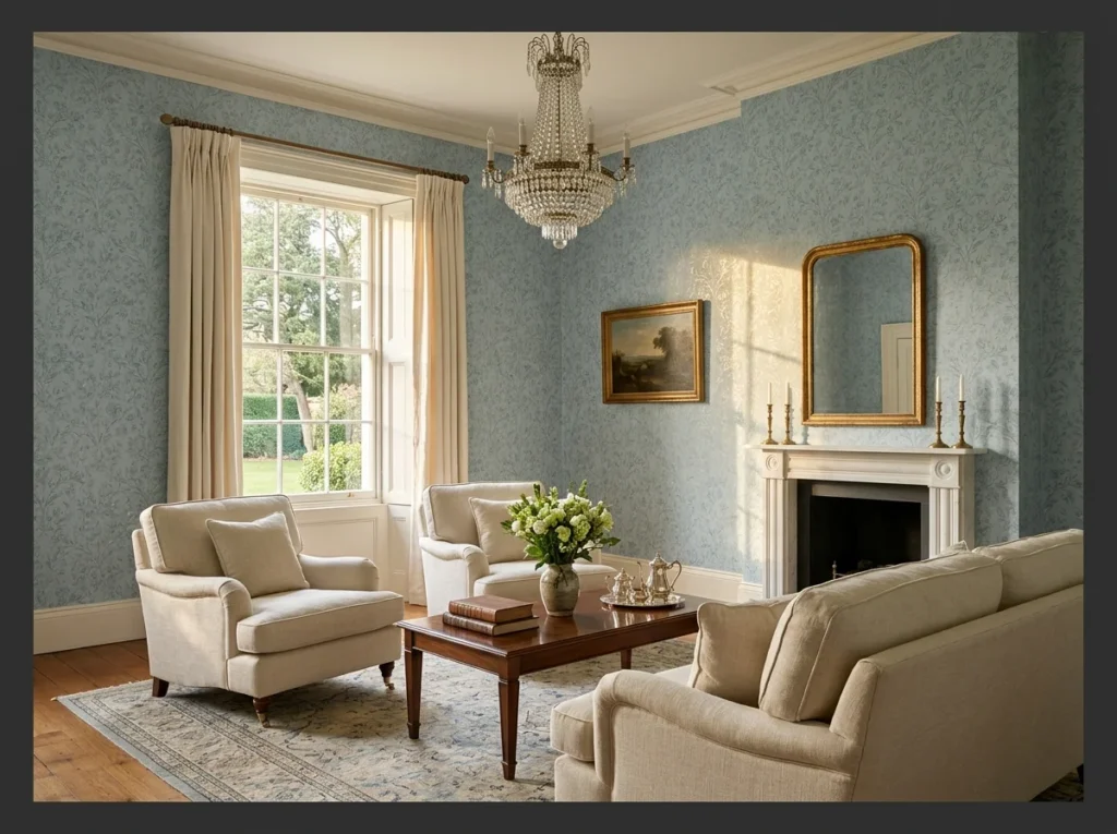
Dusty blue walls with deep dark walnut furniture create the most sophisticated and grown-up version of a light blue living room. The muted gray in the dusty blue and the rich depth of walnut share a similarly serious quality that makes the combination feel genuinely elegant.
This palette suits formal living rooms and adults-only spaces where the mood is calm and considered rather than casual and playful. A warm brass floor lamp adds the metallic warmth needed to prevent the cool blue and dark wood combination from reading as too serious or heavy.
Light Blue Wallpaper with Subtle Pattern
A subtle pattern in wallpaper adds texture without overwhelming the room with too much detail. Light blue as the base color keeps the pattern from feeling too busy or loud. This approach suits a room wanting depth beyond flat paint alone.

A light blue wallpaper with a subtle botanical or geometric repeat adds depth and visual texture that flat paint cannot achieve. The pattern creates a surface that the eye travels across rather than simply resting on, making the room feel richer and more considered.
Choose a pattern where the repeat is subtle enough that the overall impression at normal viewing distance reads as a blue wall with added texture rather than a busy patterned surface. Small scale botanical prints, faint geometric repeats, and soft linen effect textures all achieve this at varying price points.
Light Blue Fireplace Surround
Painting just the fireplace surround light blue turns it into an unexpected focal point. This detail works well against neutral walls, letting the color stand out clearly. It suits a living room wanting a smaller scale color statement.
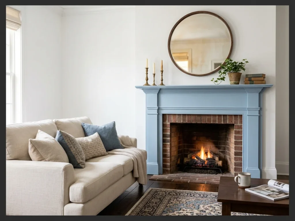
Painting only the fireplace surround in light blue while keeping the surrounding walls white creates a focal point that draws the eye immediately without overwhelming the room with color. The fireplace becomes a piece of painted furniture within the room rather than simply an architectural feature.
This is a weekend DIY project that costs only the price of paint and primer. The result adds significantly more character and personality to a plain white living room than a new piece of furniture at ten times the cost. A round mirror or botanical art print above the mantel completes the vignette.
Japandi Light Blue with Natural Materials
Japandi style blends Japanese minimalism with Scandinavian warmth, often through natural materials. Light blue fits into this palette as a quiet, understated color choice. This combination suits a living room wanting calm, considered simplicity.
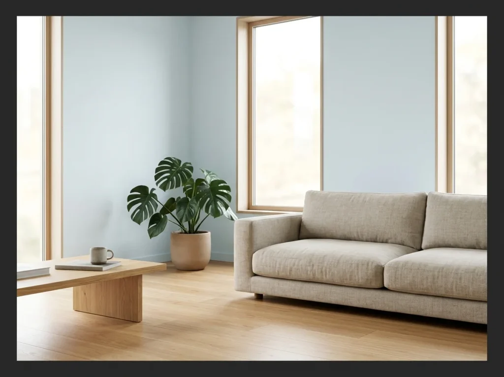
A Japandi interpretation of a light blue living room uses the palest, most muted version of the color available closer to the lightest sky blue than to a saturated powder blue. Everything in the room is low, natural, and chosen with extreme care. Nothing is present purely for decoration.
Natural clay pots, solid oak furniture, linen upholstery, and one large statement plant are the complete material palette for this style. The light blue wall serves as a meditative background that gives the room its distinctive atmosphere without competing with the quiet strength of the natural materials in front of it.
Light Blue and Sage Green Together
Light blue and sage green sit close enough on the color wheel to feel cohesive rather than clashing. Both are muted tones, which keeps the overall room feeling calm. This pairing suits a living room wanting more than one color without much contrast.
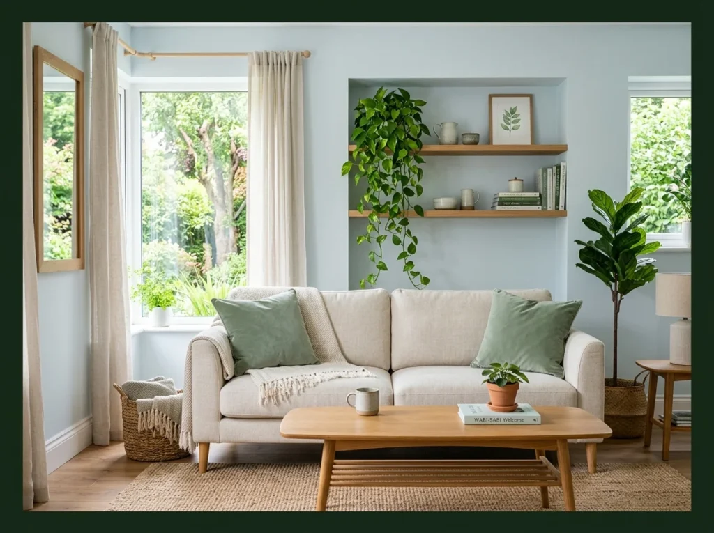
Light blue and sage green together create a nature-inspired palette that feels like the inside of a calm garden. Both tones are muted and desaturated which means they coexist without competing and the combination creates an organic harmony that is deeply restful to spend time in.
Use sage green as the accent through pillows, a throw, and a plant rather than introducing it on a second wall surface. The plant specifically bridges the gap between the painted sage accent and living nature in a way that makes the whole palette feel genuinely organic rather than coordinated.
For more on choosing the right plants for a palette like this, greenery that grounds a cool palette has plenty of ideas worth trying.
Light Blue Curtains on White Walls
Curtains bring color into the room without needing to repaint any walls. Light blue against white keeps the space feeling bright and airy. This approach suits renters or anyone wanting an easily reversible color change.
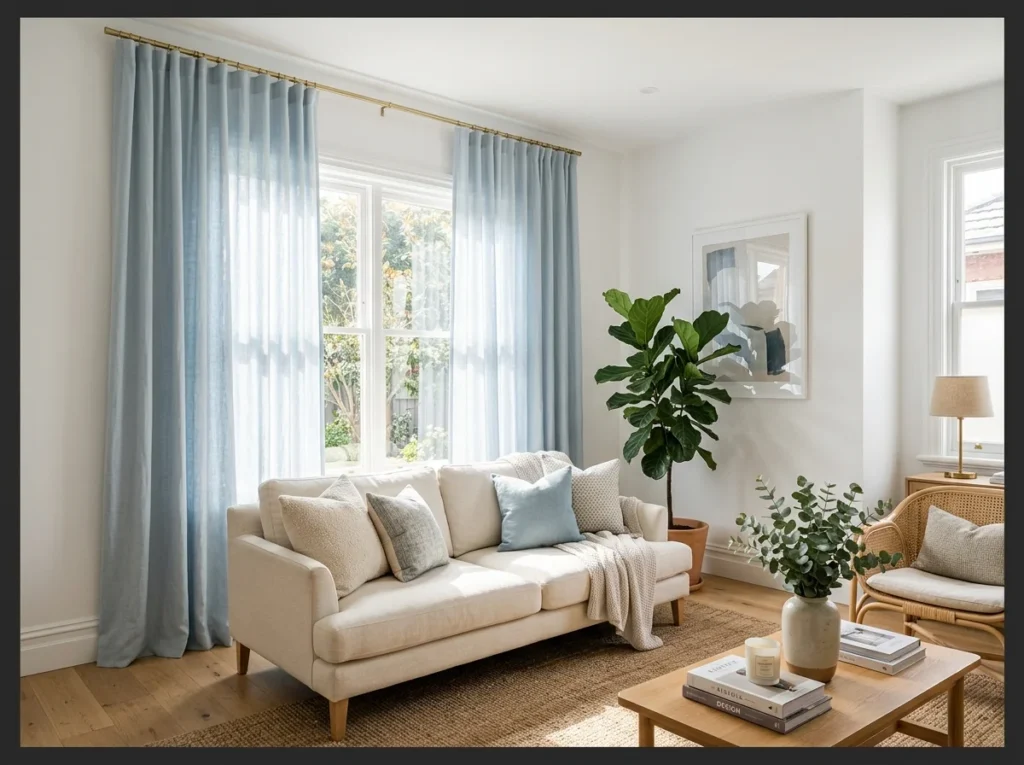
Floor to ceiling light blue linen curtains on white walls introduce color through the largest available vertical surface in the room without touching the walls at all. The gentle blue shifts from pale sky in bright afternoon light to a deeper, moodier tone by lamp light in the evening.
Perfect for renters. This is one of the most impactful color changes available without painting a single wall. Mount the curtain rod close to the ceiling and let the curtains touch the floor for the full elongating effect that makes any room with this treatment feel significantly taller.
Light Blue Area Rug on Natural Wood
A light blue rug adds color at ground level rather than on the walls. Natural wood flooring underneath keeps the overall look warm despite the cool color above it. This pairing suits a room wanting color introduced gradually rather than all at once.

A light blue area rug on warm natural wood floors introduces the color at floor level rather than on the walls, creating a grounding anchor for the seating area while the walls stay in a warm neutral. The contrast between the cool blue rug and the warm golden wood floor is immediately striking.
Choose a rug large enough to sit under all four legs of the sofa for the most grounded, cohesive result. A rug that only partially touches the sofa always looks undersized and accidental. Getting the scale right is the single most important decision when using a colored rug as the primary color statement in a room.
Light Blue Painted Window Trim
Painting just the window trim light blue adds a small but noticeable detail. This approach works especially well against white walls, where the trim stands out clearly. It suits a room wanting color in a smaller, more contained dose.

Painting only the window trim and frames in light blue while keeping walls white is a subtle architectural detail that adds color without any commitment to a full wall paint. The blue outlines each window like a frame, drawing attention to the views outside and adding a cottage character.
Budget friendly option. This transformation requires only a small amount of paint and an afternoon of careful trim work. The result creates significantly more architectural interest than plain white trim and s
Light Blue Media Wall
A media wall painted light blue gives the television area a bit more visual interest. This approach works well when paired with simple, matching shelving on either side. It suits a living room wanting the media area to feel intentional rather than an afterthought.
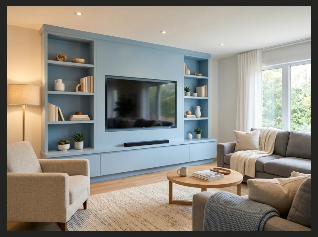
Painting the media wall in light blue while the rest of the room stays white gives the television wall a purpose beyond housing the screen. The blue creates a backdrop that absorbs the TV visually rather than having it sit as a black rectangle on a blank white wall.
The light blue against the dark screen creates a gentle contrast that is significantly easier on the eyes during evening viewing than a white wall which creates strong contrast with the screen. Built-in shelves painted in the same blue on either side of the screen complete the wall as a cohesive architectural composition.
If you want more ways to make the television disappear into the room, a screen that blends into the wall covers the idea in more depth.
Light Blue and Blush Pink Palette
Light blue and blush pink together create a soft, slightly nostalgic color pairing. Both tones stay muted enough that the room does not feel overly sweet or bold. This combination suits a living room wanting a gentle, romantic feel.

Light blue walls with soft blush pink accents create the most delicate and romantic living room palette available. The cool of the ice blue and the warm of the blush pink are close enough in saturation that they never clash and far enough apart in tone to create genuine contrast.
Use blush as the accent through two pillows, a waffle throw, and one ceramic object. Three points of blush create the palette story clearly without it overwhelming the fundamental lightness and airiness of the blue base. This combination photographs beautifully in morning light and consistently performs very well on Pinterest.
Boho Light Blue with Macrame and Plants
Macrame details and plants soften the coolness of light blue with natural texture. This combination leans into a relaxed, bohemian style rather than a crisp, formal look. It suits a living room wanting color alongside a lot of organic material.
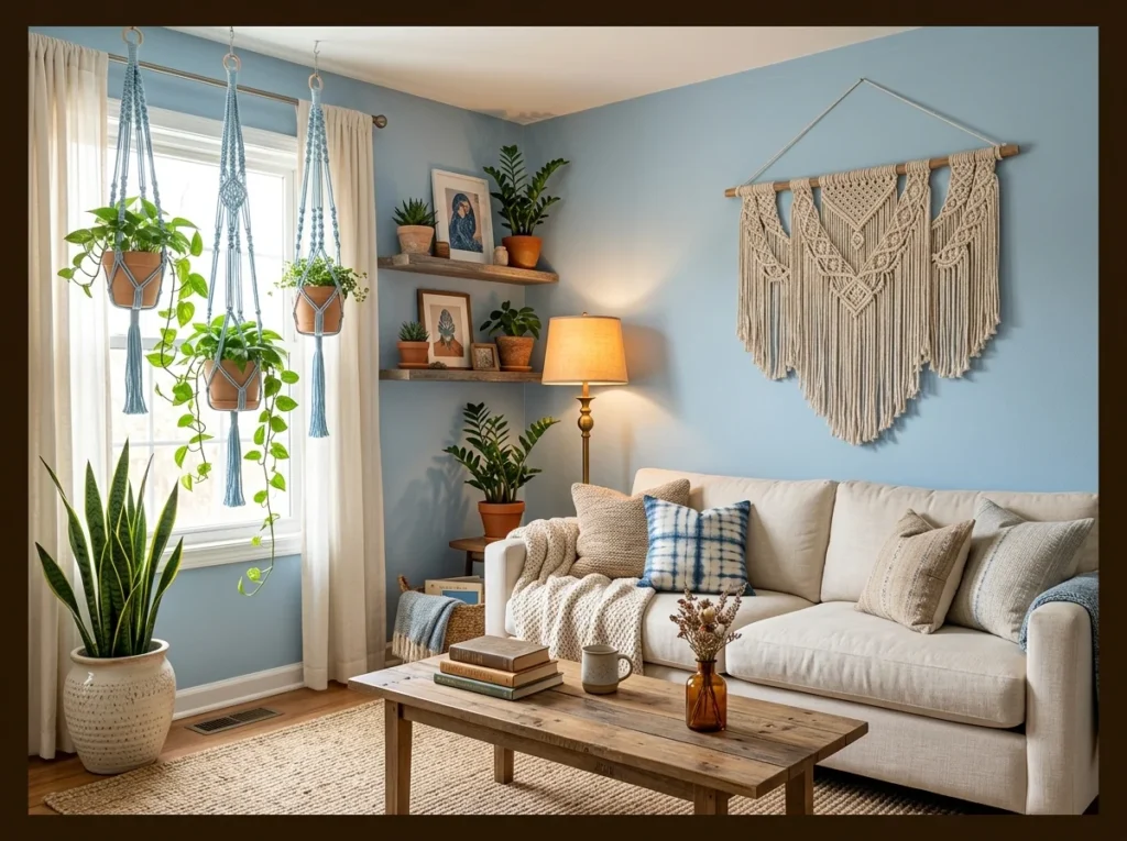
Powder blue walls in a bohemian living room provide the perfect quiet backdrop for all the organic textures and natural materials the boho style celebrates. The blue calms the visual energy of multiple textures and patterns and gives the room a breathing space between its many elements.
Multiple plants in terracotta pots add a warm earthy contrast to the cool blue wall that makes the palette genuinely dynamic. The combination of pale blue, terracotta, cream linen, and natural fiber creates a sensory richness that suits this style’s relaxed and collected spirit completely.
If you’d rather skip color altogether and still land on this same calm, a quieter neutral built the same way shows how it’s done.
Light Blue Paneled Accent Wall
Wall paneling painted light blue adds dimension that flat paint alone cannot offer. The raised panel lines catch shadow differently depending on the light in the room. This detail suits a living room wanting texture alongside color.
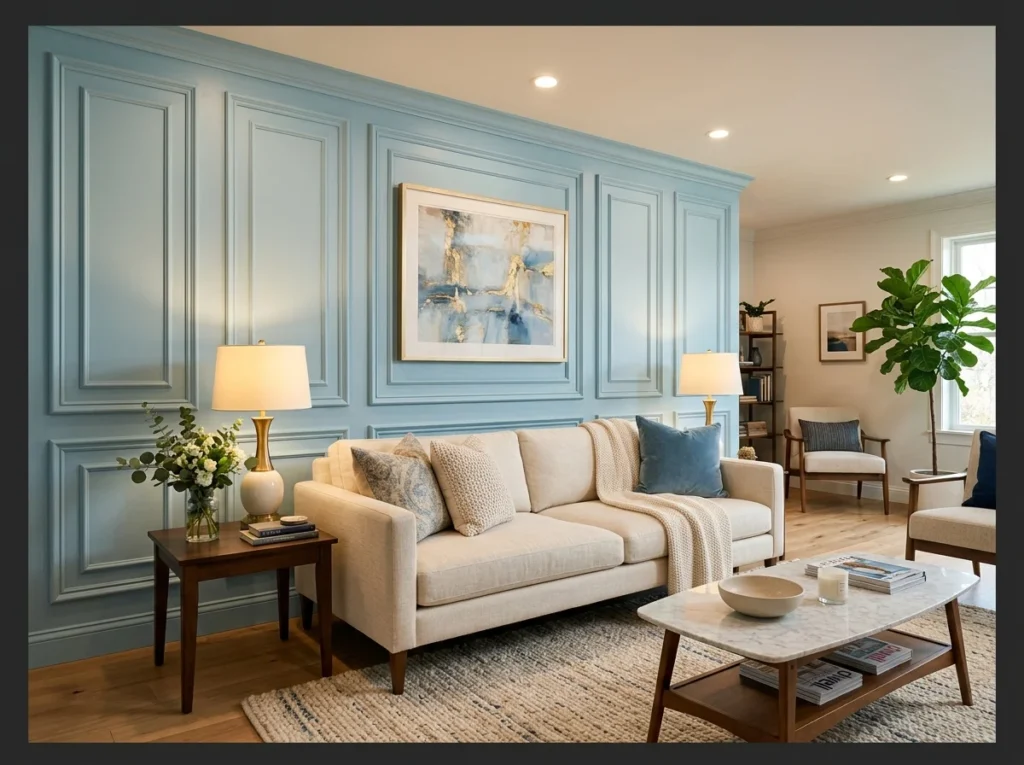
A paneled accent wall painted in light blue adds both color and three dimensional architectural texture to the wall behind the sofa. The shadow lines between the panels create depth that a flat painted surface entirely lacks, making the wall feel custom built rather than simply decorated.
This is achievable as a weekend DIY project using standard MDF panel moulding applied directly to drywall. The panel shadow lines are most visible in side lighting from a table lamp which makes evening viewing particularly dramatic. It is one of the most impactful and relatively inexpensive upgrades a living room can receive.
Light Blue with Terracotta Accents
Terracotta brings warmth that balances out the cooler tone of light blue. This pairing works well through cushions, pottery or small decorative accents. It suits a living room wanting contrast between warm and cool tones.
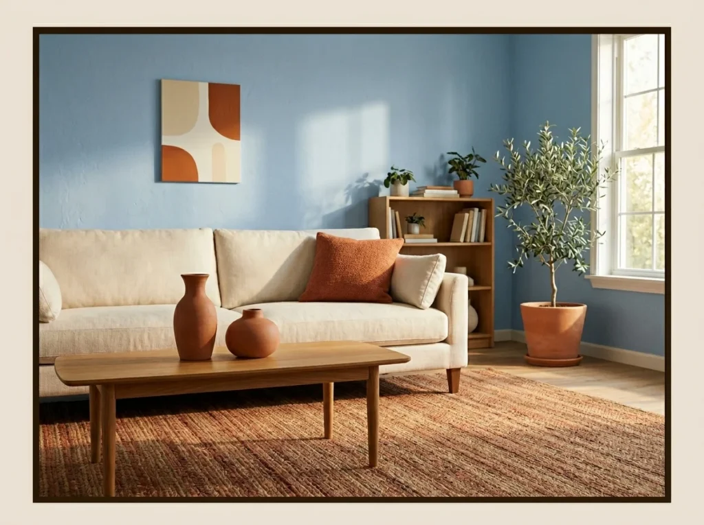
Terracotta is the most unexpected and most rewarding accent color in a light blue living room because the warm orange earth tone creates the strongest possible contrast with cool blue while the earthy quality of terracotta prevents the combination from feeling too bold or artificial.
Use terracotta in ceramic accessories, one throw pillow, and a rug with rust tones woven through it. The ceramic objects specifically look extraordinary against a blue wall because the material is so grounded and natural. This is one of the most current and most Pinnable living room palettes available right now.
Light Blue Ottoman as Room Centerpiece
A light blue ottoman placed centrally becomes a small but noticeable color statement. This piece also doubles as extra seating or a spot to rest feet during longer evenings. It suits a room wanting color introduced through furniture rather than walls.
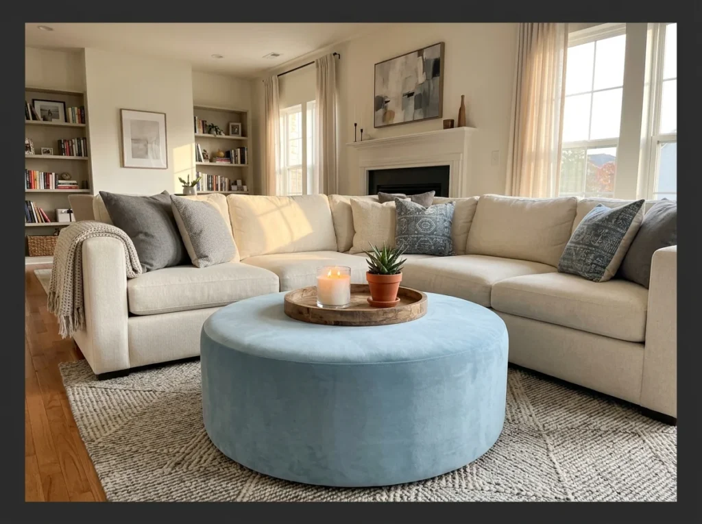
A large round light blue velvet ottoman as the coffee table introduces the color at the center of the room rather than on the walls, giving the whole scheme a different quality. The blue sits at floor level where it anchors the seating arrangement and invites everyone to gather around it.
Top the ottoman with a wooden tray to create a stable surface for drinks and objects. A round ottoman also removes the sharp corners of a standard rectangular coffee table which makes the whole seating area feel more relaxed and social. This is a particularly good option for living rooms with young children.
Light Blue with Brass and Gold Details
Brass and gold accents add shine that plain light blue on its own does not offer. This combination suits a living room wanting a bit of polish alongside its soft color palette. Even small details, like lamp bases or picture frames, are enough to bring in this metallic touch.
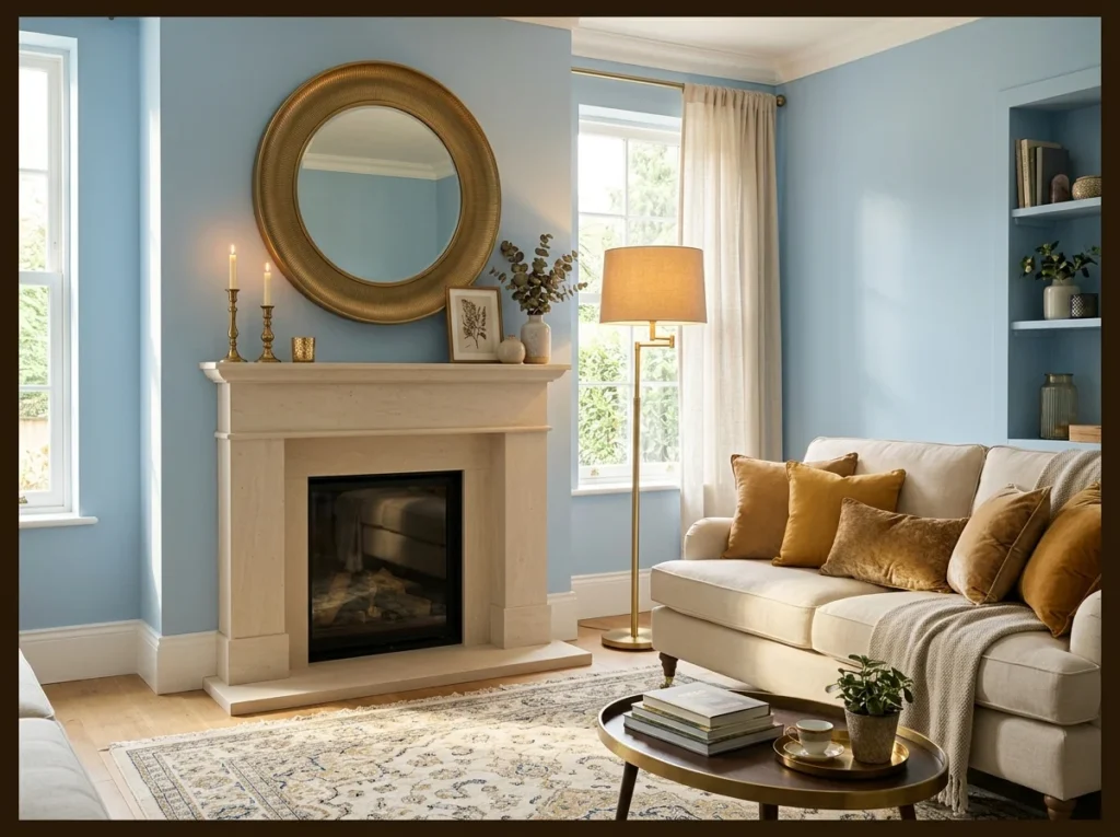
Brushed brass and warm gold accessories in a light blue living room create a combination that feels genuinely luxurious. The warm metallic tones add richness and light catching surfaces that the matte blue wall cannot provide on its own, and the contrast between cool blue and warm gold is one of interior design’s most enduring and reliable pairings.
Use brass in the mirror frame, the floor lamp, and small decorative objects rather than in large furniture pieces. The metallic quality is most impactful when it appears in multiple locations at different heights throughout the room, creating a thread of warmth that connects the space from floor to ceiling level.
Conclusion
Light blue is one of the most genuinely rewarding colors to build a living room around because it does something that no other common wall color quite manages it makes people feel calmer the moment they walk into the room. Whether you go all in with powder blue walls and a coastal aesthetic or introduce it subtly through a velvet ottoman and linen curtains, the quality it adds to daily life is consistent and immediate.
Pick two or three ideas from this list that match your natural light conditions and your existing furniture. Start with the simplest change a paint color test, a pair of blue velvet pillows, or a light blue curtain panel. Everything else builds naturally from there.
And if this sense of calm is what you’re after throughout the home, a bedroom that carries the same calm proves the same principles work well beyond the living room.